SUNDIAL · PRODUCT DIRECTION & DESIGN
A clearer shape
for the day.
I’m designing Sundial to make time easier to understand, the next step easier to see and progress worth noticing.
Independent product · Interaction design & design system · Private beta in preparation
01 · STARTING POINT
Start with the next decision.
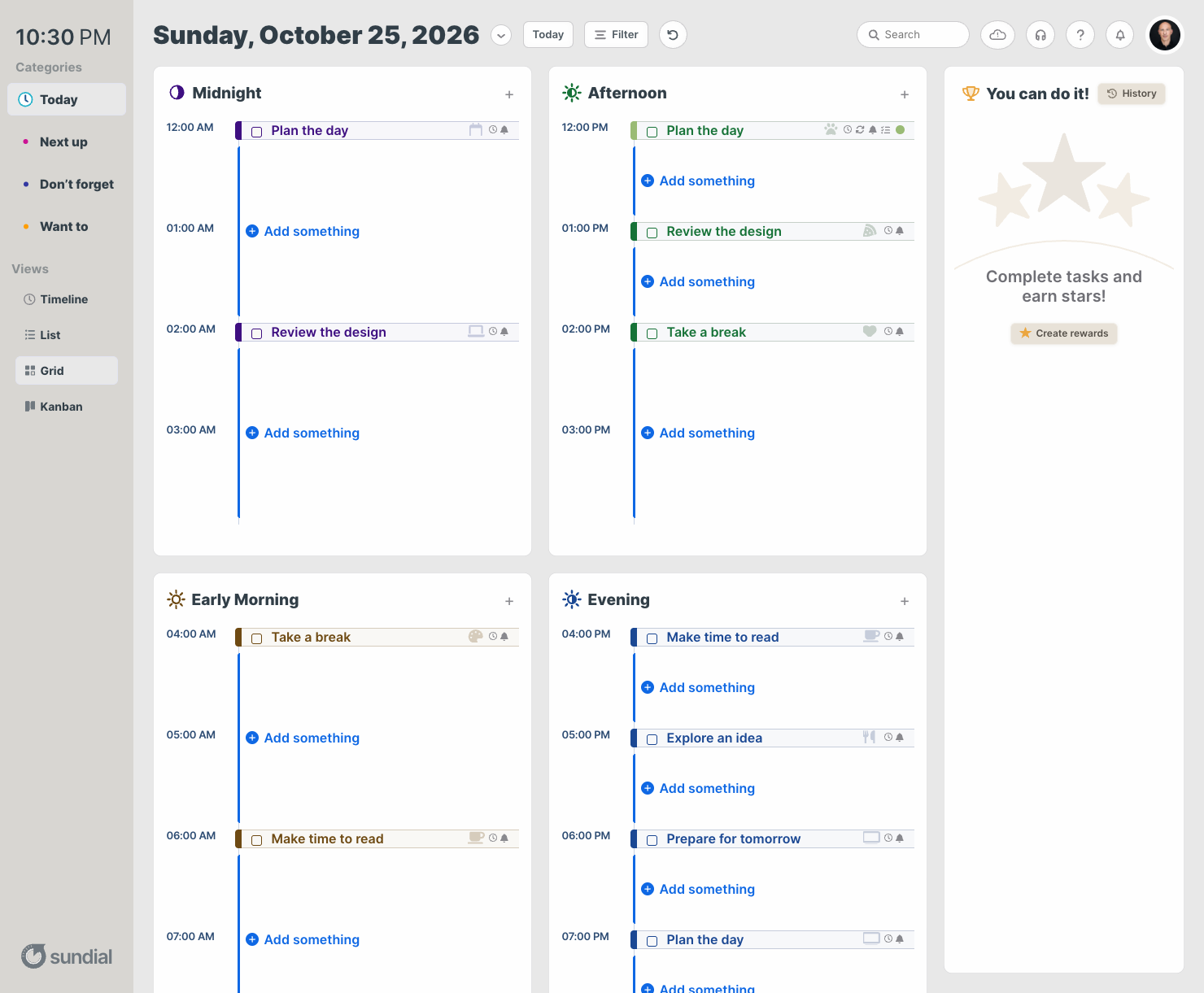
I care about building useful structure for people with ADHD and different ways of thinking. That is a central reason I’m developing Sundial. I wanted a planner that helps someone understand what is in front of them without asking them to organize everything before they can begin.
I set the product direction, refined the Figma design and guided the interaction and design-system decisions through implementation review. My focus has been the relationship between the parts: how a day is divided, where a task belongs, what its duration means and how the interface responds when it is finished.
I separated work that belongs on today’s schedule from work that needs a place to wait. Today offers Grid, Timeline, List and Kanban. The Next up, Don’t forget and Want to collections use List only. The choice of view stays close to the kind of decision someone is making.
02 · MAKING TIME VISIBLE
Show what time actually holds.
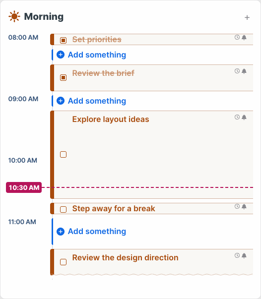
A list can give a fifteen-minute task and ninety minutes of focused work the same visual weight. In Sundial’s scheduled views, duration determines the space a task occupies. Hour labels, task placement and the current-time marker follow one scale, so the day can be read as time rather than as a stack of equally sized items.
I wanted open time to feel available. Each free interval has one place to add something, and a new task begins with an explicit fifteen-minute duration. It does not silently take over the whole gap.
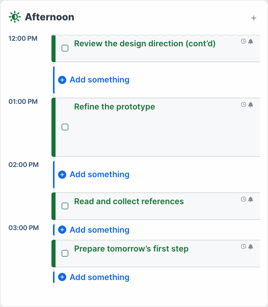
Grid divides the day into parts, but a task can cross those boundaries. I kept that work connected through continuation edges and a repeated title. In the example below, a review begins at 11:30 and continues into the afternoon. It remains one task even though the view shows it in two places.
03 · CLOSING THE LOOP
Keep finished work in view.
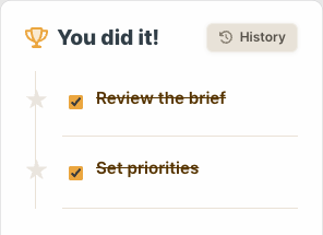
Finishing a task should change the experience. I kept a completed task visible in the schedule and brought it into a dedicated progress panel. The day still shows where the time went, while the completed work has a place of its own.
In this example, setting priorities and reviewing the brief are finished. Their checked states appear in the morning, and both tasks appear under “You did it!” The action can be reversed by unchecking a task. History provides another route back to completed work.
I kept the feedback restrained. The check, the task title and its new place in the completion panel do the work. Motion is limited to the deliberate clock-hands interaction, with reduced-motion behavior respected.
04 · CONNECTING THE DETAILS
Make the decisions hold together.
I refined the visual language around Inter, the supplied SVG artwork, shared spacing and semantic colors. Grid and Flex layouts carry those decisions across the interface. The aim is for a change to improve a pattern wherever it appears, rather than fixing one screen in isolation.
That work reaches into the quieter moments: a form label that stays visible, an error that explains what needs to change, a selected duration that is clear, and a calendar that stays in place while dates change. These details are part of the planning experience, not finishing touches around it.
Review also led to stronger empty-state text contrast and larger activation areas for compact controls. A dense time scale still creates a real constraint: a fifteen-minute block cannot hold every control at a generous size. The refined compact targets and the more spacious List view are part of the response. Real-device and assistive-technology evaluation remain ahead.
Sundial is in private-beta preparation. The interface shown here has been reviewed locally for visual and interaction behavior. I can show the design decisions and working interactions here; how the product supports people over time is the next thing to learn.